We are sure most of you are aware of the devastation that the Bushfires are causing in Australia: about 5 million hectares of land have been destroyed, millions of animals have lost their home and more than 20 people have lost their lives. In the last weeks, numerous images and maps have been shown in media platforms in order to inform and raise awareness about the issue. The viral image of Australia first posted by Anthony Hearsey called our attention as remote sensing specialists.
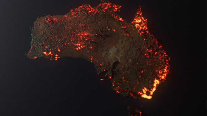
Thousands of people shared the image as if it was ‘real’ map of the ignited surface in the first week of 2020 before it was reported as ‘fake news’. Of course, the absence of smoke, clouds, and the exaggerated extension of the burnt areas made us skeptical about what does it really represent. Digging into the details of how this image was created, we learned that the author considered the image as an artistic visualization of one month of data of locations where fire was detected according to NASA’s FIRMS (Fire Information for Resource Management System, https://firms.modaps.eosdis.nasa.gov/map/#z:3;c:83.5,-6.9;d:2020-01-15..2020-01-16 ). In our understanding, the image can be considered a heat map based on the FIRMS grid of areas used for emergency units and authorities for management purposes.
The tricky part here is that when a determined gridded area is signaled as burned, it means that there are fires within that area, but not that the whole area is on flames. Thus, the surface of the burned area is smaller than the area represented on the map due to 2 reasons: the FIRM detections do not mean that the entire area is burned, and the scale of the rasterization to create the final image exaggerates the already too big gridded areas.
As NEO we wanted to show you a satellite image of the South-Eastern coast of Australia during the first week of 2020. The VIIRS images of 3 and 4 January 2020 shows the smoke plumes caused by the bushfires. In those we clearly see the large impact the fires and smoke have in this part of the world.
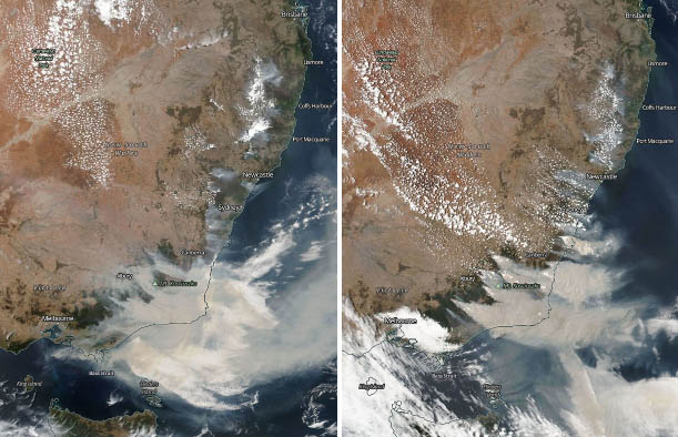
Figure 1: True colour visualisation of VIIRS on 3 January and 4 January 2020. This image shows a realistic overview of the smoke plumes caused by the fires along the South-Eastern Australian coast.